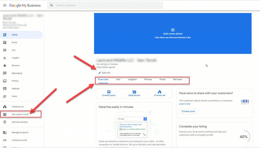
It all began with Ben Fisher’s tweet on May 9 when he shared a screen shot of the new dashboard for Google My Business.


GMB’s New Console & Users’ Reaction
It all began with Ben Fisher’s tweet on May 9 when he shared a screen shot of the new dashboard for Google My Business(GMB).
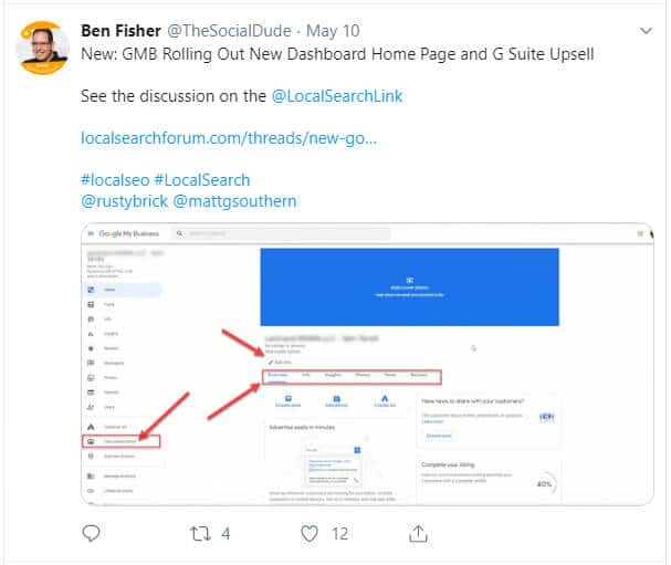

Reactions began to pour in on different forums and channels and majority of the users were a little perplexed with the need for such a change in the design and dashboard for GMB, especially in a short span of just one year. Many expressed their concern over the fake business listings and voiced their opinion that dealing with them should be the priority for Google, rather than making such cosmetic changes, that hardly serve any purpose and create more confusion.

A Quick Peek into GMB
Looking back at GMB, this platform was launched in June 2014 and has since remained one of the most sought-after platforms, especially for local businesses. This allows a better visibility to the businesses and gives greater control to the business owners to communicate, entice and win their target customers via posts, photos, videos, and other relevant available tools.
What Has Changed?


The first look reveals a few major changes in the look and feel of GMB. The three main changes that one can easily tell are:
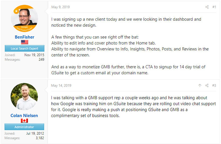
- You can now edit your info and cover photo from the home tab itself.
- The navigation has become relatively easy with options right from overview to info and from posts to reviews, everything has come in the middle of the screen.
- A very direct attempt to upsell GSuite with a tab on the left. According to Ben Fisher, there is a CTA as well to get started with the 14-day free trial for GSuite.
Are There Ways to Leverage the Changes?
This is perhaps the most interesting and important question, what’s the opportunity here? Looking at the apparent changes, it appears that there has been an attempt to make the platform more user-friendly. The very fact that all the options are right there at the centre of the screen, makes it easier for the business owners to quickly change and test, what is working and what is not working for them.
Of course, upselling of GSuite is something that Google is most interested in, however, whether it can work for you, only you can decide. GSuite is basically a set of cloud computing, productivity and collaboration tools, software and products developed by Google for ease of data saving and synchronisation. By the end of 2017, GSuite recorded a whopping 4 million paying businesses.
If you are not sure whether GSuite is something that you need for your business, you can anyways get started with the 14-day trial and check for yourself about its efficacy for your business.
Besides, it would be too early to say any concrete benefit that this design and dashboard change would bring. Let’s wait for the formal announcement for the same and see what new features GMB brings to give a boost to businesses.

